Developing a Marketing Website for a Document Processing Platform
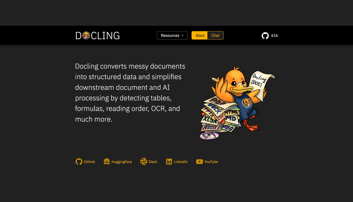
We built a marketing website for a document processing platform that transforms unstructured documents into structured data using OCR, table detection, parsing, and intelligent extraction for AI-driven workflows.
A marketing site for a document processing platform
We created a marketing website for a document-processing platform to make it easier for organizations to convert unstructured documents into usable, structured data. It has powerful document-understanding features, including OCR, table detection, reading order, formula extraction, and document parsing, enabling easy downstream processing and AI workflows.
The website was built to clearly convey the capabilities of the platform, offer educational content, product details, and webinar registration. The overall objective was to provide a fast, responsive front-end user experience that enabled them to manage leads and awareness of their products without adding too much complexity to content management.
One webinar form, two placements, zero duplication
A primary challenge was dealing with a registration form that was located in two separate areas of the webinar page and had various field layouts and formats. The one version was in the hero section, featured in a 2-column layout; the second version was further down the page, featured in a single-column layout.
If the forms had been split out individually, it would have duplicated the validation logic and state management, and added extra maintenance costs if there were ever changes to the form requirements. The challenge was to stick with various visual forms while keeping the functionality of the forms in one central location and throughout the entire application. The team had to make sure that the different devices' screens looked great and acted exactly the same, while maintaining the uniformity of form layout between sections.
How we built it: Next.js, React, and a reusable form core
Built the backend application in Express.js and MongoDB, and the frontend application in Next.js, React, and TypeScript for a fast and scalable marketing experience with good performance and maintainability. Responsive layout and uniform styles throughout the site were accomplished with Sass and Bootstrap. In order to address the form duplication issue, we created a single reusable form component that would be customized to fit the page requirements. A boolean prop called isWeb was used to conditionally render the fields to flexibly position them, but with a single source of truth for state management, validation, and submission handling.
It not only allowed for all the separated business logic but also saved future maintenance. If validation rules, form fields, or submission workflows are modified at any time, these changes can be made once and applied to both placements. It's also deployed on Vercel to ensure fast page delivery, an efficient deployment pipeline, and smooth front-end performance.
What we shipped: lead capture with 40-50% less form code
We created a responsive marketing site that featured the website's document processing features and facilitated webinar sign-ups, lead capture, and product education. These solution components were elastic frontends, responsive page layouts, and optimized sign-up processes that were optimized for long-term support.
By using the re-usable form architecture instead of running multiple forms implementations, it is estimated that 40-50% of the front-end code was saved. In the future, new versions may be implemented far more quickly and without the fear of version differences, as the validation and state management are centralized. Optimizations for the front-end enhanced responsiveness on every device and made maintenance easier. The component-driven approach cut down on creating efforts for subsequent improvements and also helped to keep a uniform user experience across the site.
The outcome: a clearer story for structured data
The front end (UI) of the site was enhanced, making it easier and more scalable for users to explore their suite of document-processing options. Product information, education content, and webinar registration flows were accessible to visitors via the same intuitive and cohesive user experience.
The reusable component architecture also ensured maintenance was easy in the long run due to reduced logic duplication and enhanced development efficiency. This helped to make updates less complicated to implement in the future without adding unnecessary complexity to the codebase. This project illustrates Coding Crafts' proficiency in creating maintainable frontend applications that are based on a reusable component system, scalable frontend architecture, and responsive user experience, all designed to ensure smooth product growth and scalability.
Let's build the next one.
Have a project like this? Tell us what you're building. A real person reads every message and replies within one business day.